The app
The writing canvas
A distraction-free editor set in real book typography. It's built to get out of the way — everything else in the app hangs off the margins of the page.
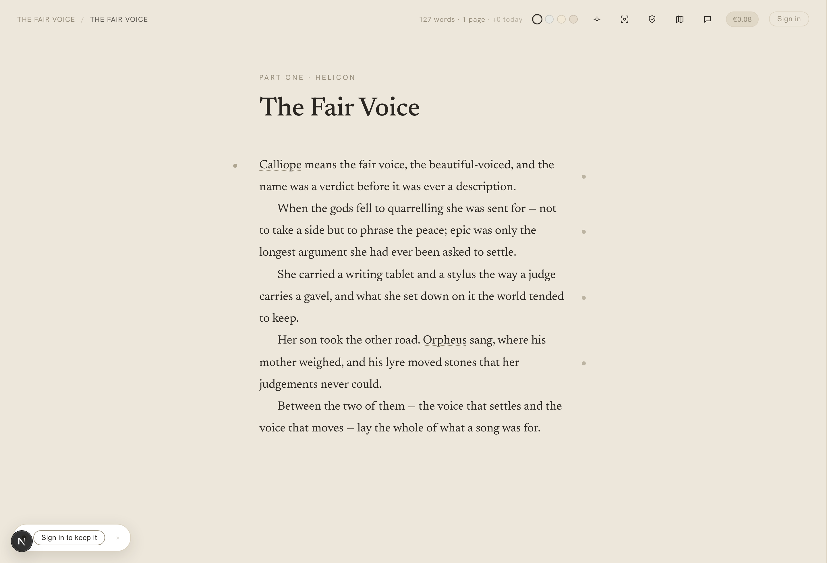
The canvas — book typography, gutter dots down the margins, recognised names, and a faint toolbar at the edge.
On this page
- Book typography
- The Appearance menu
- Paper themes
- Light and dark
- Typeface, size, and the chapter opener
- The caret and selection
- Focus mode
- A distraction-free frame
- Typewriter scrolling
- The chapter title
- Moving between chapters
- The gutter dots
- Moving text to another chapter
- Autosave
- Version history
- Craft lenses
- The lens, and the guidance behind it
- The word lenses
- Custom lexicon: any language
- The structural lenses
- Spell-check
- On a phone
The canvas is where you spend your time in Calliope. It’s a single column of serif prose at book measure, with the chrome kept faint and to the edges so the page is the thing you look at.
Book typography
Your prose is set the way a printed book is set, not the way a text box is:
- Indented paragraphs, set solid. Body paragraphs run with no blank line between them; each new paragraph begins with a first-line indent that scales with the type size. The first paragraph of a chapter — and the first paragraph after a scene break — is flush left, with no indent, exactly as a typesetter would do it.
- Scene breaks. A section break renders as a spaced centred row of middots (
· · ·) with symmetric breathing room above and below. To make one, you don’t reach for a menu: on a blank line a faint— — —hint appears, and pressing Tab (or typing---) commits the break. - A live word count sits in the top chrome and updates as you type.
This is a reading-fidelity choice: what you see on the canvas is close to what the exported book will look like.
The Appearance menu
The palette control in the editor’s top bar opens the Appearance popover, grouped into three tabs so a lot of choice stays tidy:
- Surface — the paper tone and the light/dark setting (below).
- Font — the typeface, text size, and chapter opener.
- Ambience — an optional, reactive backdrop. It’s off by default; see the Ambience page for the options.
Everything you pick here is remembered in your browser across sessions, and applies whether you’re signed in or writing anonymously.
Paper themes
Calliope isn’t stark white. Four warm paper tones — Oat, Mist, Sand, Clay — live under the Appearance menu’s Surface tab, and the whole app re-tones to match your choice. Your selection persists across reloads, so the app stays the colour you like.
Light and dark
The paper tones are only half of it. Calliope also has a light and dark setting, and it’s a second axis layered on top of the papers — every paper has a dark variant. So it’s paper × light-or-dark, not a separate set of themes: dark Oat still reads warm-neutral, dark Sand still leans gold. Dark keeps the same house rule as light — warm, low-contrast, no pure black and no pure white.
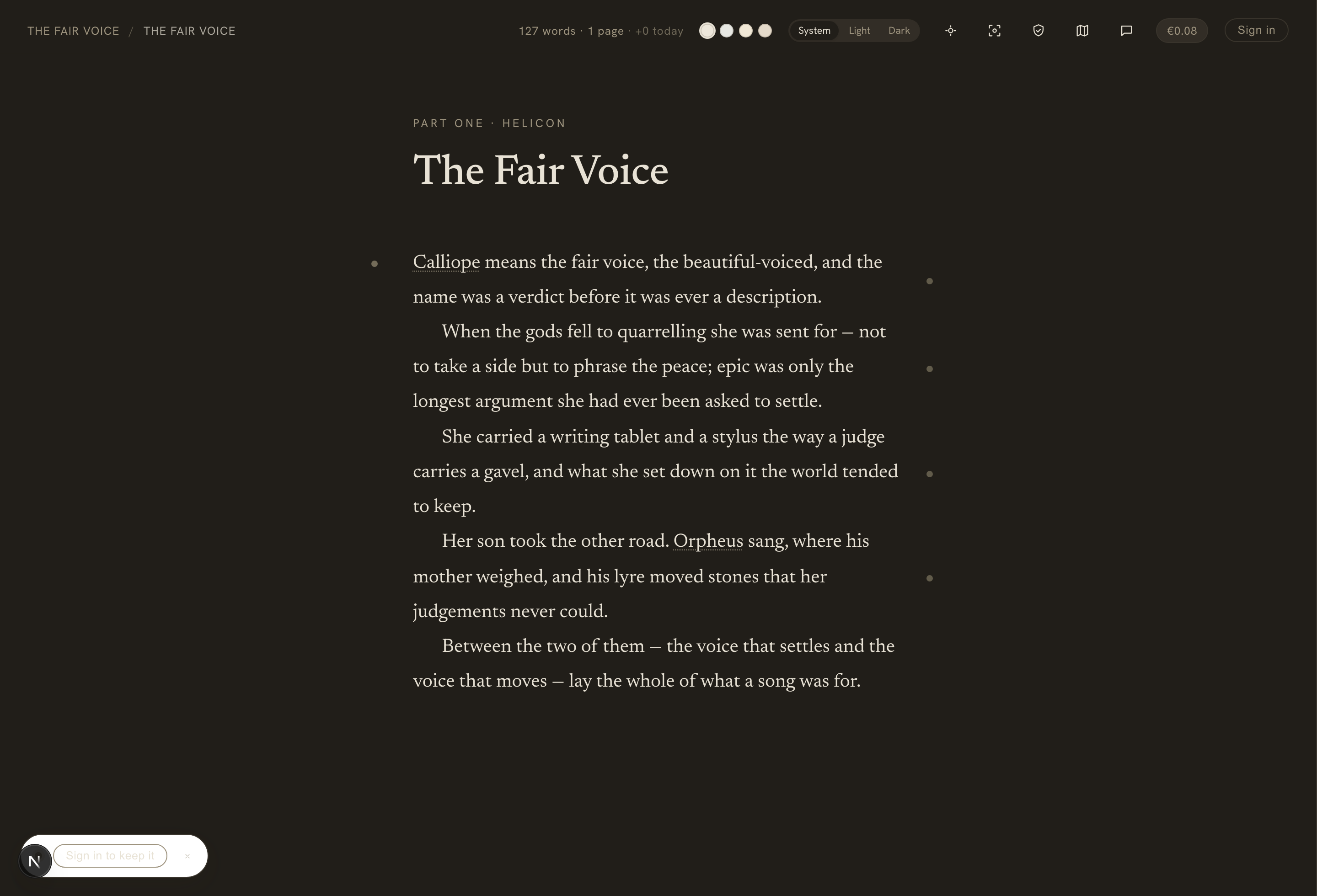
On the same Surface tab, beside the paper swatches, sits a small System / Light / Dark control (and it’s in the ⋯ actions menu on a phone):
- System follows your device’s appearance setting — and flips live the moment your OS switches between light and dark, with no reload.
- Light and Dark are explicit overrides: pick one and it sticks until you change it.
Like your paper choice, the setting is remembered in your browser across sessions, and it applies whether you’re signed in or writing anonymously.
Typeface, size, and the chapter opener
The Appearance menu’s Font tab is where the page becomes a book rather than a text box.
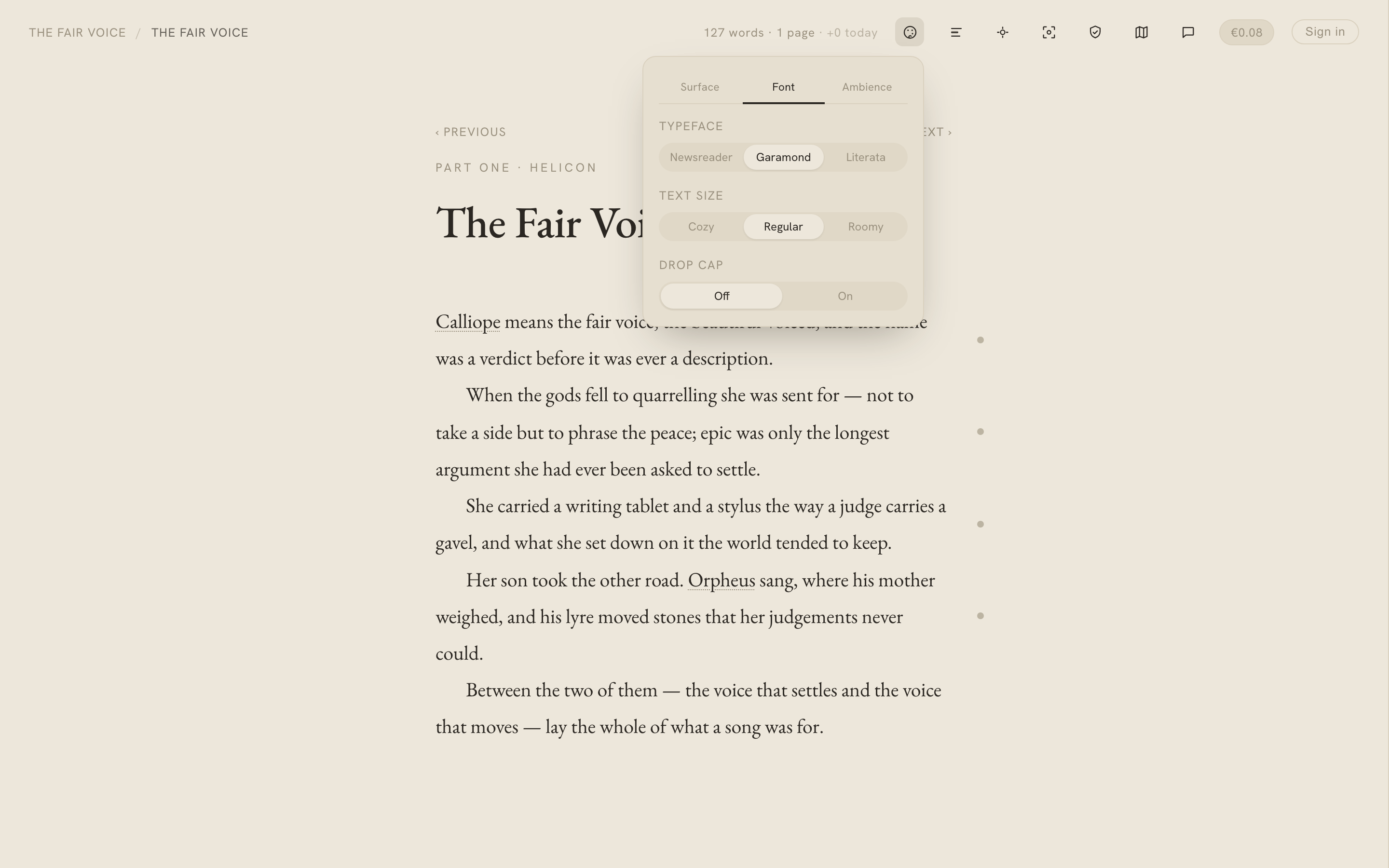
- Typeface. Three literary serifs to set your prose in: Newsreader (the default), EB Garamond, and Literata. Only the one you pick loads, so choosing an alternative never slows the default down. Garamond and Literata bring old-style figures and small caps with them, for numbers that sit in the line and section openers that read like print.
- Text size. Cozy, Regular, Roomy — one control that scales the type size, its leading, and the paragraph indent together, so the page stays proportioned at any size rather than just zooming.
- Chapter opener. An optional drop cap sinks a large book-style initial into the first paragraph and sets its opening line in small caps — the flourish a printed chapter begins with. Off by default; a single toggle turns it on for the whole book.
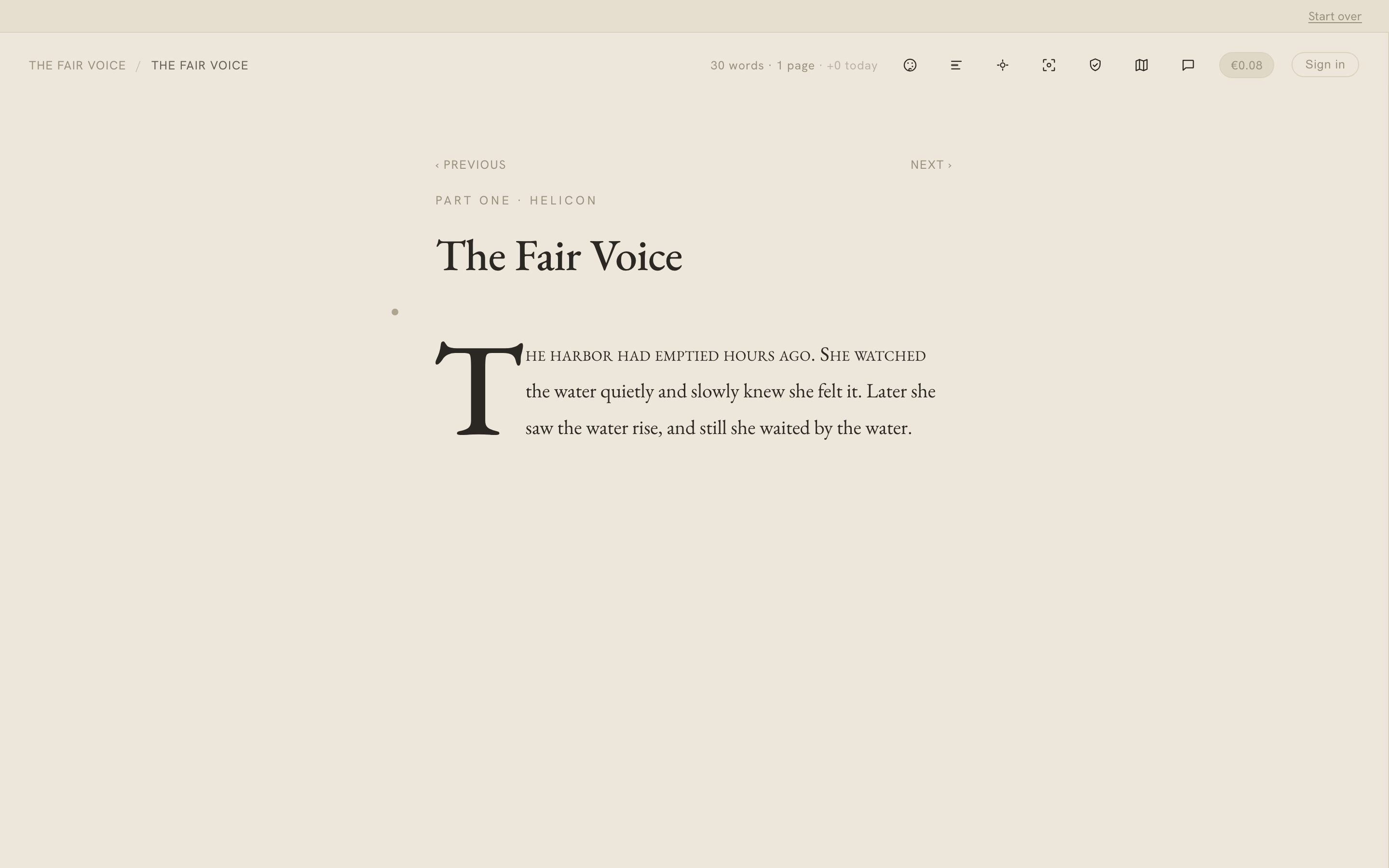
Like everything in Appearance, your typeface, size, and drop-cap choices are per-book and remembered across sessions.
The caret and selection
Small touches make the canvas feel less like an input field. The caret has three styles to choose from — the default bar, a steady underscore that sits on the baseline, or a typewriter slab — and the text selection is a warm ochre rather than a system blue, tuned to each paper and to dark mode so it always sits softly on the page.
Focus mode
Toggle focus mode and everything dims except the paragraph you’re working on: the rest of the page fades back, the block under your cursor stays at full strength, and the chapter header recedes. It’s for the moments when you want the sentence in front of you and nothing else.
A distraction-free frame
As you write, Calliope quietly fades the toolbar and page furniture away, leaving just your words on the page. It’s tied to writing, not idleness — the moment you move the mouse (or tap, or scroll) everything reappears. Your prose and the chapter title always stay put; only the surrounding frame fades.
Where focus mode dims the other paragraphs, this hides the frame around them — the two work together. If the marginalia pane is open the chrome won’t hide (you’re working with it then), and if you use your system’s reduce-motion setting the change is instant rather than a fade. There’s nothing to switch on: it just happens while you write, and keeping the mouse moving keeps everything in view.
Typewriter scrolling
On a desktop-sized window, the line you’re writing stays around the middle of the screen — a touch below, really — instead of creeping down to the bottom edge as you type. The page scrolls under your cursor, a gentle “typewriter” feel, so you’re never writing against the very bottom of the window and never have to stop and scroll up for room.
It’s automatic — there’s nothing to switch on. And it knows when to step aside: on phones and on short windows it stays out of the way and keeps the normal scrolling, so it never eats into a small screen.
The chapter title
The chapter’s title sits at the top of the canvas as an editable line — click and type, and it saves when you move away or press Enter. An unnamed chapter shows its number instead (its position across the whole book), so a manuscript written as a plain numbered sequence looks right without you naming anything. Clear a title and the number comes back.
Moving between chapters
Just above the title sit Previous and Next controls, so you can move through the manuscript in reading order without going back out to Structure each time. Hovering one shows the neighbouring chapter’s title; at the very first or very last chapter, the control that would lead nowhere simply isn’t shown.
The gutter dots
Down the margins of the page are small dots, and they’re the quiet hinge between your prose and everything Calliope keeps beside it:
- A dot in the left margin tracks your cursor as you type, arrow around, or click — a subtle marker of where you are.
- A dot in the right margin marks a paragraph that has something anchored to it — a note, a to-do, a chat thread. Paragraphs without anything are quiet; hover a paragraph, or move into the gutter, and its dot appears so you can add something.
Click a right-margin dot and the marginalia pane opens beside that paragraph — the prose reflows to make room rather than being covered over. A card in the margin can also jump you back to its paragraph, pulsing the dot when you land. See Marginalia for the full picture.
Moving text to another chapter
Sometimes a scene ends up in the wrong chapter. Select one or more paragraphs and the same selection bubble that offers Link to fact also offers Move to…:
- Pick a destination — search or browse the list of every other chapter.
- Choose where it lands — drop it at the beginning or at the end of that chapter, or choose Hand-pick a spot…, which opens a quiet, read-only view of the destination where an “insert here” line follows your cursor to the nearest paragraph break; click to place the text exactly there.
Two things make this safe to do mid-draft:
- Your marginalia travels with the text. A note, to-do, or chat thread anchored to a moved paragraph follows it into the new chapter — nothing is left behind.
- It’s reversible. You land in the destination with the moved text briefly pulsing, and a small bar offers Return (jump back to where it came from) and Undo (put everything back exactly as it was).
You move whole paragraphs — a partial selection rounds out to the paragraphs it touches. It’s the paragraph-level companion to reordering whole chapters in Structure.
Autosave
Autosave runs on a short debounce as you write — not on every keystroke, but you never press save.
Version history
Because autosave overwrites the chapter in place, Calliope also keeps a quiet version history behind it — so a bad paste, an accidental select-all-and-delete, or a rewrite you talk yourself out of is never the end of the story.
As you write, it checkpoints the chapter on its own: a new version whenever roughly ten minutes have passed or you’ve changed about a paragraph’s worth of text, whichever comes first, plus one when you leave the chapter. Identical saves are skipped, so the list stays meaningful rather than long.
Open Version history from the editor’s top bar — beside Scan and Check — or from a chapter’s ⋯ menu over in Structure. You get the checkpoints listed by time and length; select one to read its actual prose first, so you always see what you’re about to bring back, then Restore this version. Restoring is never destructive: your current text is checkpointed first, so a restore is just another version — you can restore your way back out of it.
Version history is a signed-in feature (the versions live on your account, not in the browser), kept for 30 days, and free — no credits, ever. For recovering a whole chapter or part you deleted, rather than an earlier draft of one you kept, see Deleting — and getting it back.
Craft lenses
Beside the Appearance control in the top bar sits an Analysis button — its own icon, with a small dot when a lens is on. Open it and you get craft lenses: ten reading passes that colour your own habits onto the page. The wash is always on the manuscript itself — the analysis is the page, not a report in a side panel — and you can stack several at once.
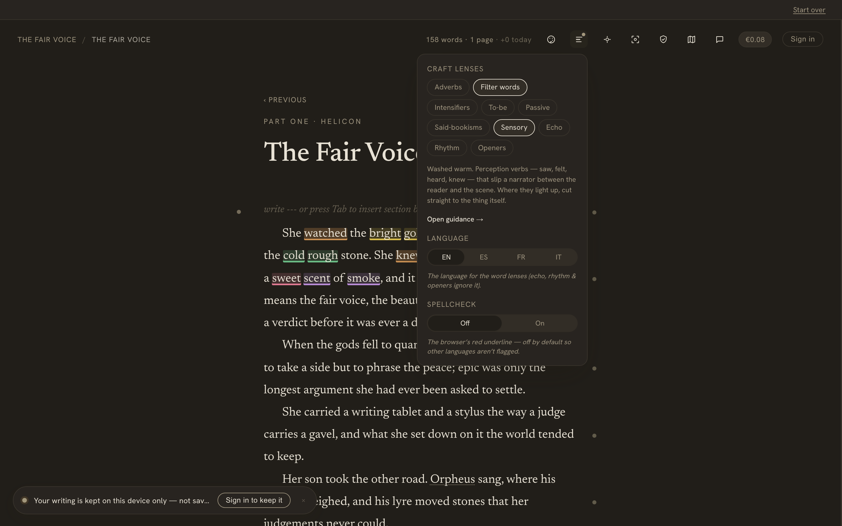
Two things hold for every lens, and they’re the whole point:
- It teaches; it never grades. There’s no score and no “fix this.” Each lens argues both sides of the habit and leaves the decision with you.
- It never touches your prose. A lens only recolours what’s already there. Turn it off and the page is exactly as you left it.
The lens, and the guidance behind it
The colour on the page is the quick read. When you want to know why a word lit up, there are two depths:
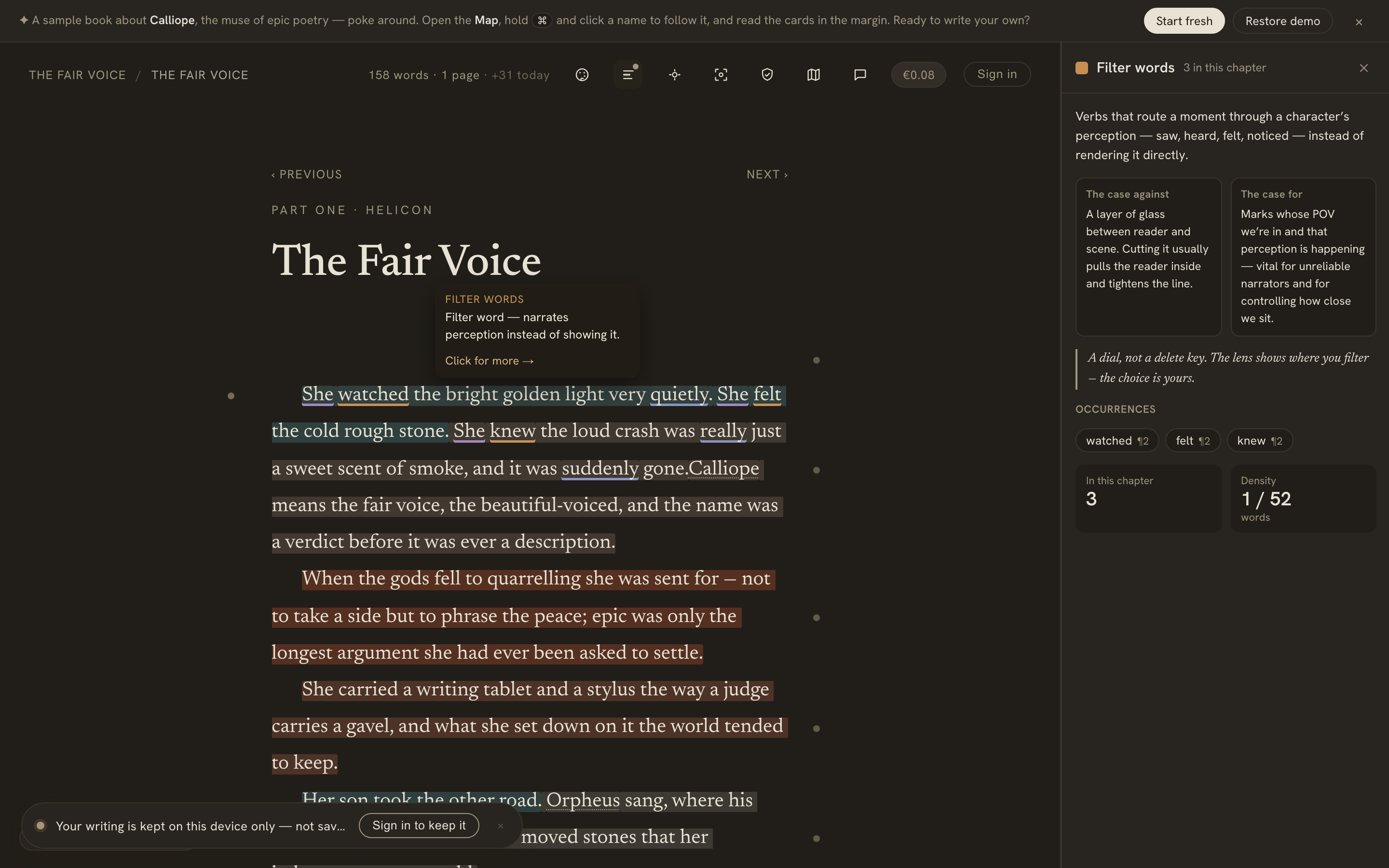
- Hover a highlighted word for a one-line tooltip — the habit, in a sentence.
- Click it (or use Open guidance) and a calm, read-only sidebar opens with the case against the habit, the case for it, and a takeaway — because every one of these “rules” is a live craft debate, not a verdict. Below that sit every occurrence in the chapter (click one to jump to it) and a quiet count and density.
The word lenses
Seven lenses look at which words you used. They run on a word list chosen from the Language selector in the Analysis menu — English, Spanish, French, and Italian come built in, and a Custom option teaches them any other language, built from your own book:
- Adverbs — the
-lywords you lean on, so you can tell the ones doing real work from the ones just propping up a verb. - Filter words — perception verbs (saw, felt, heard, knew, noticed…) that quietly slip a narrator between the reader and the scene.
- Intensifiers — very, really, just, quite, so… — the boosters that often stand in for a stronger word.
- To-be — is, was, were, been…, the static “telling” verbs. It’s everywhere, so it’s off by default.
- Passive — a to-be verb plus a past participle (“was written”). A loose, deliberately blunt nudge, also off by default.
- Said-bookisms — dialogue tags that strain past said and asked (“retorted”), and adverbs pinned to a tag (“said quietly”). It only lights up near a quote.
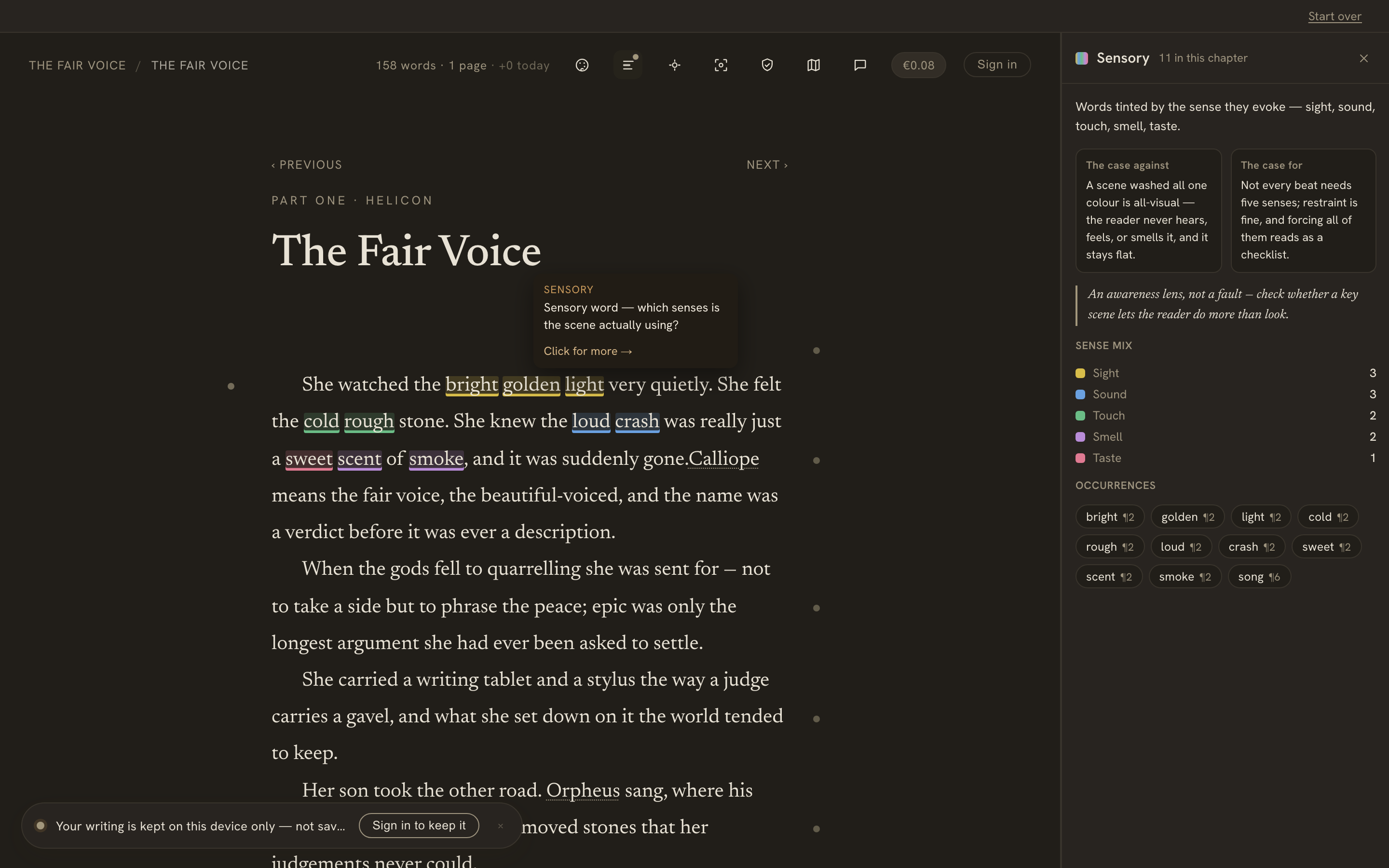
- Sensory — a five-way tint that colours words by the sense they evoke (sight, sound, touch, smell, taste), with a per-sense mix in the sidebar. It’s an awareness lens, not a fault: a scene lit all one colour is a scene the reader only ever gets to see.
Custom lexicon: any language
The four built-in languages are hand-curated word lists. For any other language — Slovak, a regional dialect, an invented one — the word lenses can learn your vocabulary from the book itself. Pick Custom in the Language selector and the Custom lexicon panel opens. (You’ll need to be signed in: the AI build and where it’s stored need an account.) The idea in one line: the AI writes the dictionary once; the free, instant lens engine reads it forever.
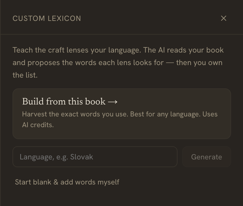
There are three ways to start:
- Build from this book — the AI reads every chapter and harvests the exact words you actually use. It’s the right route for a heavily-inflected language, where a flat word list never keeps up with the conjugated forms.
- Generate for a language — a quick draft from the model’s knowledge of that language, in a single call.
- Start blank — and add the words by hand.
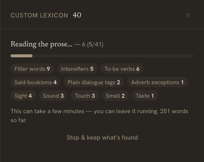
A full-book build is a few minutes of work, and it shows it rather than freezing on a spinner: a live progress bar, the chapter it’s reading, and each category’s count ticking up as words are found. Leave it running, or Stop & keep what’s found — cancelling keeps everything harvested so far.
Whatever the AI proposes is a draft — nothing is saved until you say so. The editor lays every category out as a removable chip list: prune a word, add one inline, adjust the adverb- and participle-ending rules, and Refresh from book to re-harvest as the manuscript grows. The AI proposes; you own the list.
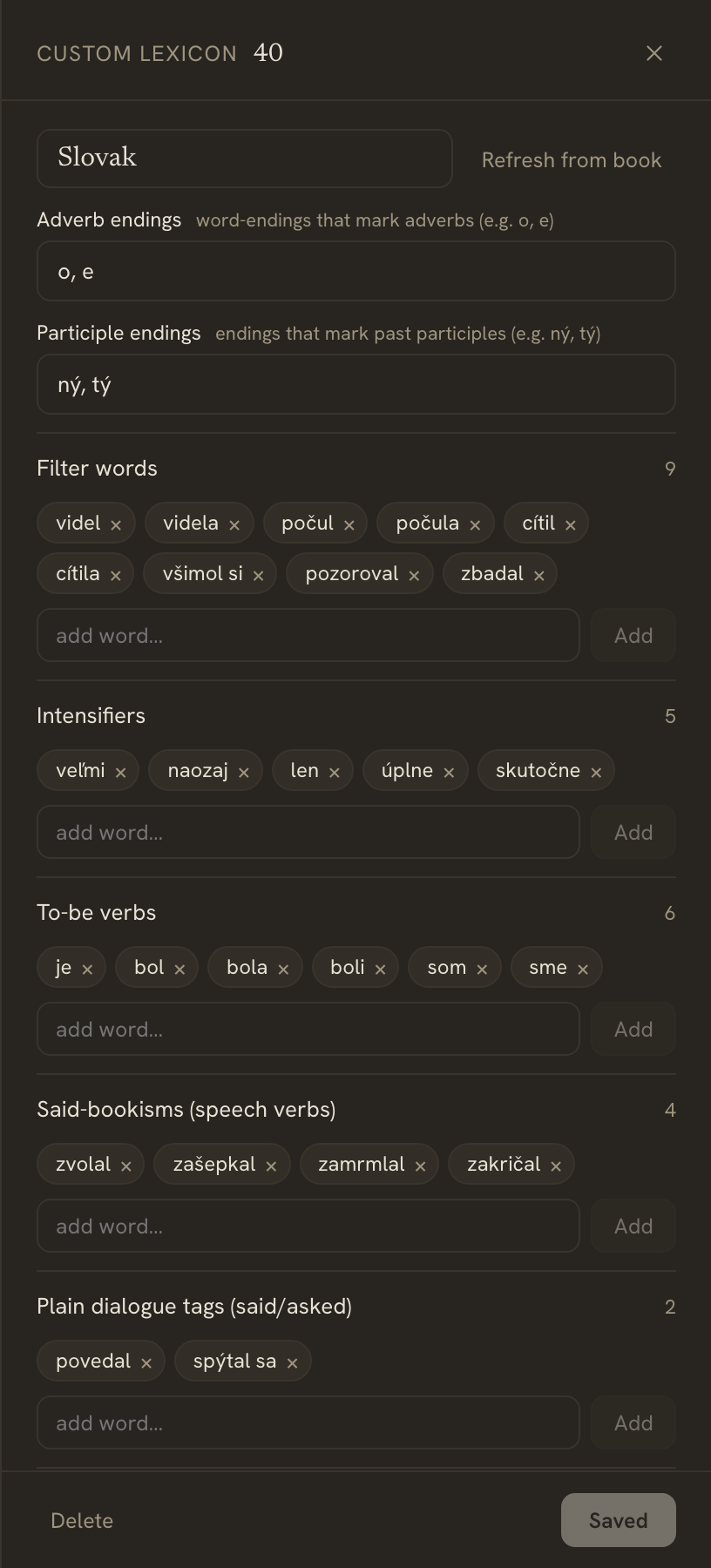
The AI build spends credits — one metered call per chapter, once; refreshing spends again, while every manual edit in the panel is free. After the build the lenses wash the page instantly and offline, on every keystroke, exactly like the built-in languages — the dictionary is a saved snapshot (which is also why new vocabulary isn’t covered until you Refresh from book). You can build and manage the same lexicon from a connected AI client over MCP or the Writer API, or just ask in chat — “build my Slovak lens.”
The structural lenses
Three lenses look at shape rather than vocabulary, so they work in any language — no lexicon needed:
- Echo — hover any word and its nearby repeats flare (within roughly sixty words), so an unintended echo you’d read straight past jumps out.
- Rhythm — a sentence-length heatmap on a continuous cool-to-warm scale. A long block of one colour is monotony creeping in; a jagged mix is prose that breathes.
- Openers — flags two or more sentences in a row that start on the same word (“She… She…”).
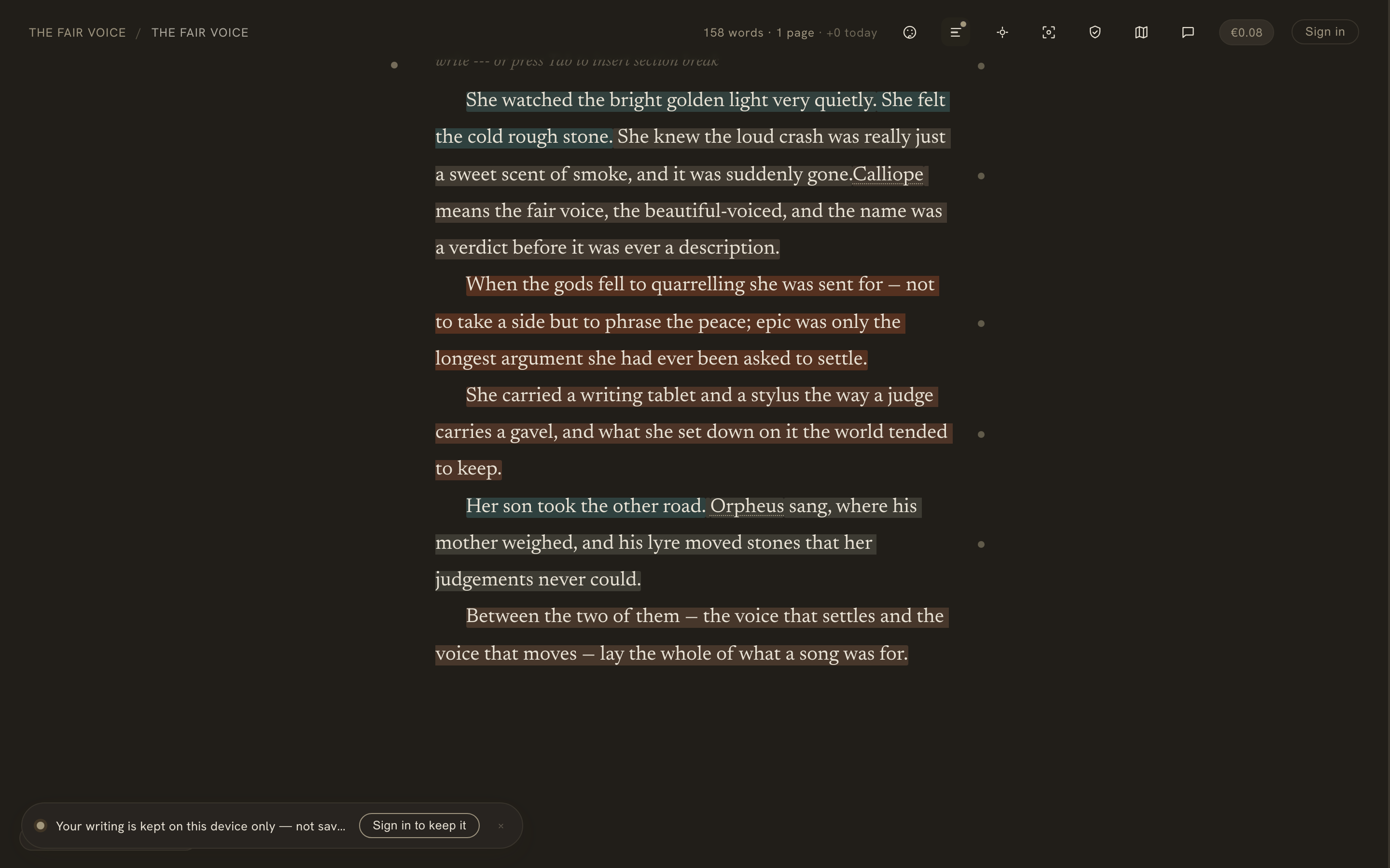
Every wash is theme- and paper-aware — each carries a saturated underline so it stays legible on any paper tone and in dark mode. And because these are local reading passes over text you already have, they cost nothing and need no account: they run the same whether you’re signed in or writing anonymously, online or off. They’re the plain-text counterpart to the AI companion, which reasons about your story; the lenses just show you your prose. There’s a dedicated Craft lenses feature page if you’d like the tour.
Spell-check
The Analysis panel also holds the spell-check toggle. It’s off by default — a manuscript full of invented names and deliberate misspellings doesn’t need every other word underlined in red, in any language, by the browser. Flip it on and native spelling underlines appear as you write; the setting applies immediately and is remembered per browser, like your paper and theme. (On a phone it lives in the ⋯ menu.)
On a phone
The canvas is fully responsive. On a phone the prose goes full-bleed with the book typography intact, the desktop toolbar collapses into a single ⋯ menu, and the marginalia open as a bottom sheet — press and hold a paragraph to bring up its notes and chat. The Map opens as its own full-screen view. Nothing is cut; it’s one responsive build, not a stripped-down mobile app.